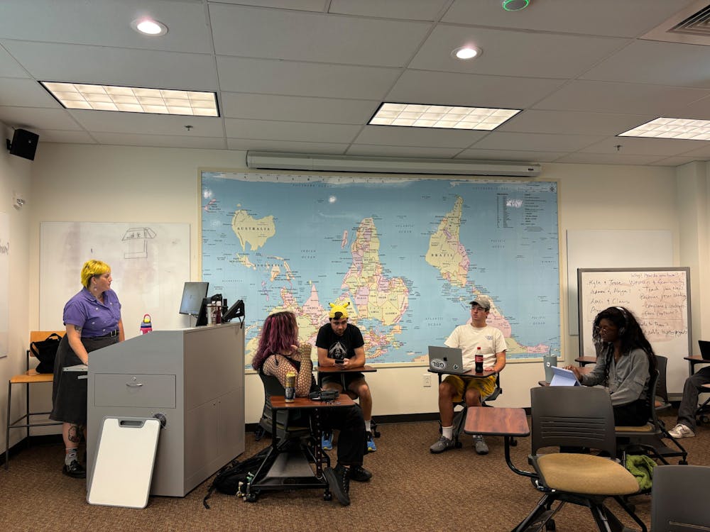
People entering Lindner 106 in Elon University’s Academic Village are immediately greeted by a large map, occupying most of the wall space. However, sophomore Matthew Fojtik said he was unsettled when he first saw it.
“It looked wrong, it didn’t look how it should look,” Fojtik said.
The map portrays the Galls-Peters projection of the world, which depicts the world with accurate land proportions.
The Mercator projection is the most commonly used world map. However, it distorts the size of land masses farther away from the Equator, making them disproportionately large. For example, Greenland appears to be larger than Australia. In reality, Australia is over three times larger than Greenland.
Also unlike traditional world maps, the one in Lindner is south side up, oriented with Antarctica reaching the ceiling and the Arctic Circle pointed towards the floor.
The map was added to Lindner 106, when the room was repainted over the past summer. Just by the door sits a flyer with a QR code taking those who scan it to a West Wing clip talking about the map’s orientation.
Art history professor Evan Gatti said she was allowed to order whatever map she wanted for the room.
“Apparently, when they installed it people came running into the dean’s office and were like, ‘It’s upside down!’ and we were like, ‘No, the names are right side up,’” Gatti said.
For the past several years, the classroom had a more typical map on display. It was mostly for decorative purposes, according to Gatti.
Gatti also spearheaded the previous design of the room when former Provost Steven House specifically asked her to create a classroom with a focus on promoting diversity. While the old map did decentralize the United States by placing Africa towards the center, Gatti said some of the boundaries and borders were incorrect. It was time for a redesign.
“The new map is intended to make an argument,” Gatti said. “I like how it’s unsettling in a way that asks you to think about some things you’ve taken for granted as fact.”
Fojtik said he grew to understand the purpose of a map looking “wrong.” He said the map forces people to change perspectives and look at the world differently.
Gatti echoed this sentiment and said the map encourages people to challenge their perspectives. She noted that something so basic, such as the way the world is visualized, may be more complicated than what is assumed.
While some faculty and students have expressed dislike and confusion towards the map, Gatti said she sees these reactions as a good thing and argues that people should have to orient themselves on a map — instead of assuming they know where they are or where everything else is “supposed” to go.
“Maps that are disorienting are truthful,” Gatti said.


